
Dark Patterns: How Deceptive Design Tricks Us
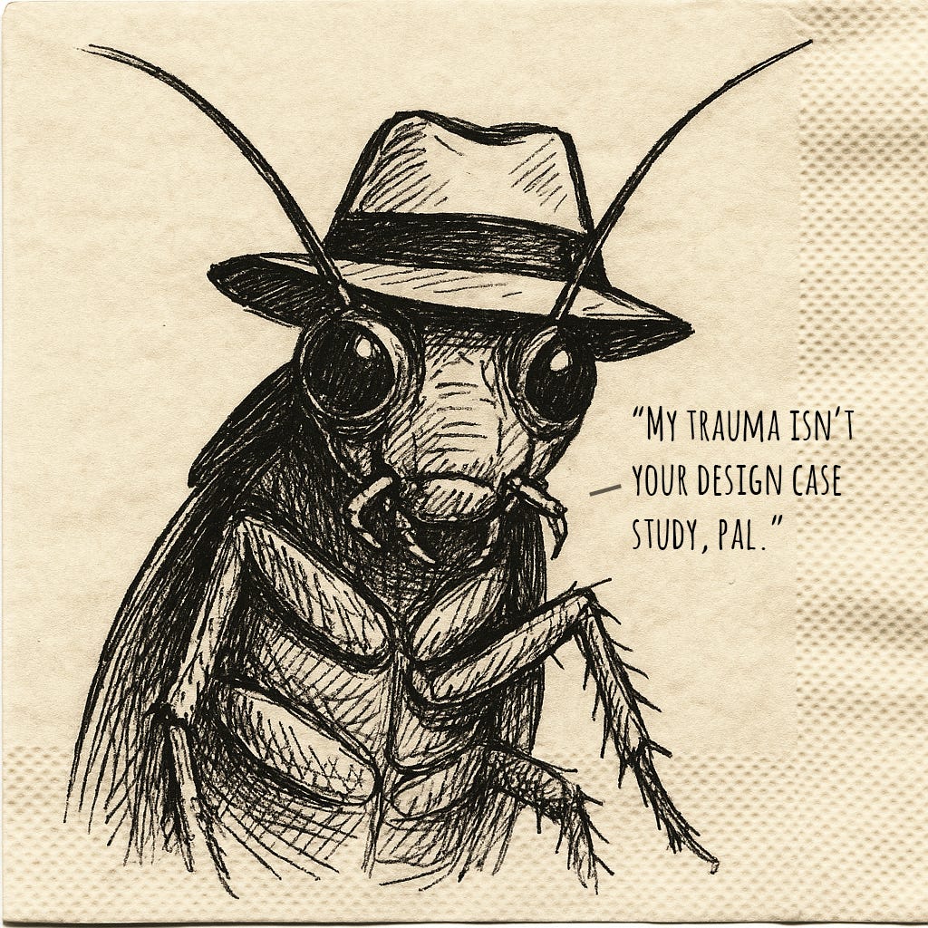
Plus, what's so insidious about a roach motel?

Issue No. 40
Have you seen those matchbox-looking traps, where an insect is lured into a box by an enticing smell, only to realize once they’re inside that their feet are stuck and their fate is sealed?
You see it with fish traps as well, where an inviting funnel makes it easy for a fish minding its own business to wander in, but it’s shaped in such a way that the fish can never get out.
There are analogs to those traps in the apps and websites we use. You’ll try to cancel a service, and the next thing you know you’ve clicked on a whole bunch of links and you’re no closer to canceling the service.
When that kind of friction is intentional, it’s called a dark pattern.
A dark pattern?
A dark pattern is any deceptive design choice that tricks us into doing something we wouldn’t have otherwise done. For instance, signing up for something, paying for something, or handing over something personal or private.
Sometimes that deception is visual. Sometimes it’s in the language we use. In the case of language, common tactics include:
꩜ False dilemmas. Subscribe or stay ignorant. We’re manipulated into a choice because the alternative is presented as some undesirable quality.
꩜ Appeals to fear. Only 3 spots left! We’re compelled by a fake sense of urgency to act immediately.
꩜ Appeals to the bandwagon. Join thousands of happy users! We’re compelled by an emotional appeal to make a decision in order to be part of some desirable in-group.
Why do they work?
They exploit certain tendencies we have. We’ve covered many of these tendencies in past issues, but as a quick refresher, here are a few of them.
꩜ Loss aversion: We’re more motivated by the fear of losing out on something (like a discount) than by the potential benefit of gaining something (like more control over our data).
꩜ Default effect. When given multiple choices, we might opt for whichever one has been pre-selected for us (the default one) because it means not having to evaluate all other options. It’s more convenient to go with what someone else has picked for us.
꩜ Anchoring bias. We’re prone to comparing all subsequent choices with the first choice we’re given. If a premium plan we’re shown first is $50, then maybe it’s not too bad that the regular one is $30. But if we’re just shown the $30 one then we might think it’s too expensive.
Eight examples of dark patterns
1. Make it hard to cancel
An app will make it incredibly easy to sign up for a product or service, but incredibly difficult to cancel it. This is often called the roach motel pattern. Easy to get in, but really hard to get out.
2. Misdirect
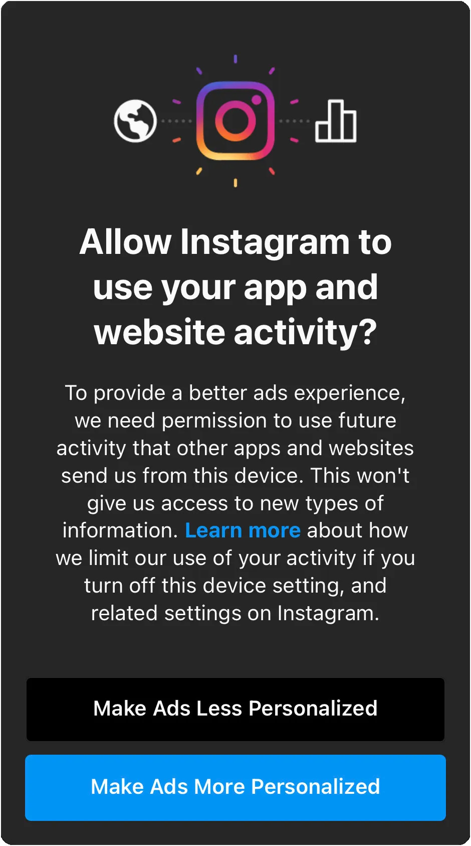
A button you’re being maneuvered to click is made more prominent. On websites that ask whether you want to allow tracking cookies, the Accept All button screams click me. The button for rejecting cookies is often a link called something like Manage Settings that takes you to a second screen and is worded such that you have to exert effort to read the whole thing and figure out what you’re agreeing to or avoiding.
3. Feign fake scarcity or urgency
You’re pushed to act fast out of fear. You’re told, “Only 3 rooms left, book now.” Or you go to a website and at the very top you see a countdown indicating that some special sale is about to end. “Hurry before it’s too late.” That fear of missing out gets you to abandon the thought you would normally put into the decision and instead make an impulsive one.
4. Use sneaky wording
There’s a pair of rules in logic called De Morgan’s laws that tell us how to rewrite a statement when a not is applied to one with and or or in it.1 I still remember how it felt when I learned about them for the first time in high school. Up until then, I thought it was only me who was slow at processing negatives and logical operators.
Like if someone were to say, “The coffee is hot and the counter is green”, I’d get that. But if they were to say, “The coffee is hot or the counter is not green,” it would take me a second to think through it.
Deceptive design can intentionally take advantage of that moment of slowness to get us to leave a box checked, for instance.
Uncheck this box if you don’t want to receive promotional emails.
5. Nag
You add a product to your cart, and then get an email from the website saying something like, “It looks like you didn’t complete your transaction?” Or an app will keep asking you to turn on notifications, or to allow it access to your contacts or photos. It’s annoying enough that you might end up folding.
6. Bait-and-switch
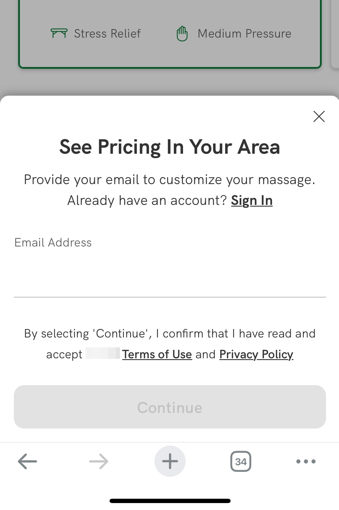
You’re on a car insurance website looking for a quote. It asks you a string of questions, and then as a final step, it asks for your email address before it can show you the quote it promised you. At no point before the process was there any indication you’d be asked to provide your email address. But now you feel compelled to because of the sunk cost (see issue no. 13) of having put in so much time to fill out all those forms.
7. Make comparisons hard
When it’s difficult to evaluate a set of alternatives against each other, we’re more susceptible to manipulation. Some services will intentionally do that. Out of a desire to put an end to your frustration, you’ll just go with whichever service you’re being maneuvered toward.
For instance, a phone carrier’s website does this.
Features are bundled in slightly different ways in each of the plans, requiring users to do some complex evaluation and mental arithmetic to weigh up the differences. Taxes and fees are included in two of the plan prices, but not included in the third. Since the taxes and fees are not shown for the third plan the user cannot deduce if it is better value or not … the user may not bother with all the effort needed to identify and understand the two cheaper plans, and they may end up choosing one of the two more expensive plans even though it may not be in their best interest.
8. Guilt the user
A website offers you a discount, and gives you the option of either accepting it by handing over your email address or clicking a link that says, “No, thanks. I prefer to pay full price.” Or a social app will tell, “Sorry, you have no friends,” and will then tell you to give it access to your contacts so that you don’t see that demoralizing message.
This one’s sometimes called confirm-shaming.
A personal example
As a complement to describing how not to do things, I thought it would be useful to share the thought that goes into designing something that aims to enhance an experience. This is an app I’m currently working on that isn’t yet public.

I use several of the concepts shared earlier. But I try to be deliberate about conveying the intent behind them, either on this page or elsewhere.2
The free plan being unavailable could have been projected as fake scarcity had I said we were out of free plans because the app couldn’t keep up with new users. That would have been a lie. Instead, I say that it will only be economical for me to have a free plan option once the app breaks even.
The most expensive plan could have been projected as sneaky wording if I’d labeled it “Most popular”. That would have been a lie too. Instead, I call it what it is, which is that it offers the best value. It could have also been projected as misdirection had the plan been in the middle and bigger than the ones on either side of it. Instead all three are the same size.
The long and short of it
Good design decisions anticipate user intent and make it easier for a user to do what they were intending on doing all along.3
When the intent is to enhance an experience, that’s good design. When the intent is to manipulate, that’s a dark pattern.
If you’re designing these experiences, be deliberate. Don’t assume people are naive or amenable.
And if you’re using these experiences, the key is to be hyperaware of attempts to misuse, confuse, or abuse you.
This week’s question
Have you seen any dark patterns in the wild or in other disciplines?
“Relax,” said the night man
We are programmed to receive
You can check out any time you like
But you can never leave
—The Eagles (Hotel California)
Until next time.
Be well,
Ali
P.S. Some past issues to read through in case you missed them.


https://en.wikipedia.org/wiki/De_Morgan%27s_laws
In crossing out the original price of $18, I explain in the FAQ that $18 is the price point that makes the most sense for me, in terms of what the service costs to operate, and that I’m making a conscious trade-off by offering it for less at release time.
There’s a set of principles known as Gestalt principles, for instance, that inform how objects are placed, colored, and shaped relative to each other to aid things like readability: https://en.wikipedia.org/wiki/Principles_of_grouping
I think streaming services have some sneaky tricks too. Popular shows don’t get renewed since the streaming service cares more about getting users to sign up with the early seasons vs the increased cost of the newer season and them hoping users forget to cancel their subscription once they have watched the show.
You hate to see it but Substack is riddled with these. I understand writers need to make a quick buck but it’s so sleazy.